Building interactive charts easily with Highcharts
June 4, 2016 Courses Tutorials
Highcharts is a well-known charting tool designed for day to day, easy to read, fast-built charts. It is a charting library written in JavaScript that supports a series of graphics - like line, area, column, bar, pie, scatter and polar chart types. You can download this library and work with its code, as long as it is not for commercial usage.
For this tutorial, we will use the online version, which is very straight forward and easy.
In this tutorial, you will need to access:
- The example data
- Register for a free account in the cloud version of Highcharts
Inputing the data
In this tutorial, we will use the tab-separated values (.tsv) data format. Differently from the .csv, the .tsv has the values of its columns separated by tabs (spaces), not commas. Highcharts also accepts .csv.
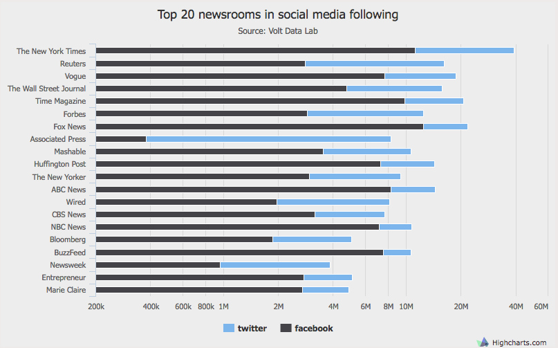
The example data shows the social media following (Twitter and Facebook) of some New York City-based newsrooms. It was compiled by Volt Data Lab, with reference in June 4, 2016.
WARNING: as cool as Highcharts is, there is still a lot of confusion when using commas and dots to separate thousands. If you use commas to separate thousands, make sure your data is clean and the columns are well aligned. If you want to use dots, don’t - Highcharts does not recognize dots as thousand separators, so, for instance, 1.000.000 will be read as a string, not as a number. In our example, we will use neither, just the plain number, as our data don’t have decimals.
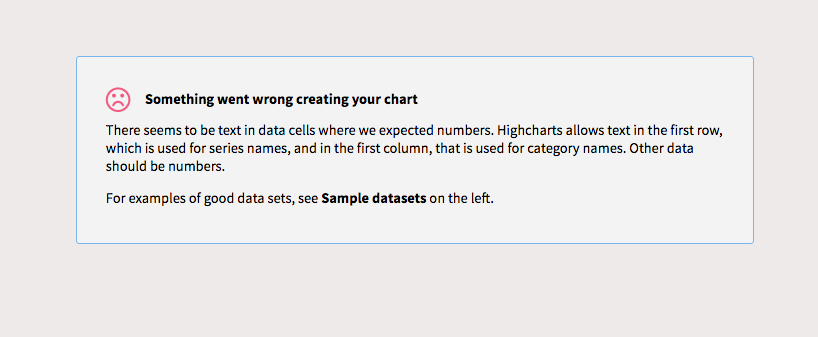
Also, at least in the the online version, Highcharts only accepts string values in the first column of your dataset or the in the column headers. This happens because of the way their code is structure to render reusable charts. If you try to input string values in any column other than the first one, you will likely get this message.
Moving ahead, copy the data and head to the online version of the tool. You can use this link to access the dataset.
After you sign up and login, you will see a button in the upper right corner, that reads “create chart”. Click on it.
Highchart’s interface is pretty simple and detailed, and you will see right away a field to input your data, in the left side. Paste the copied data there.
Immediately a line chart will pop up in the right side of the screen. But that is not the chart we want for this particular dataset, as line charts are better to show values on a time series.
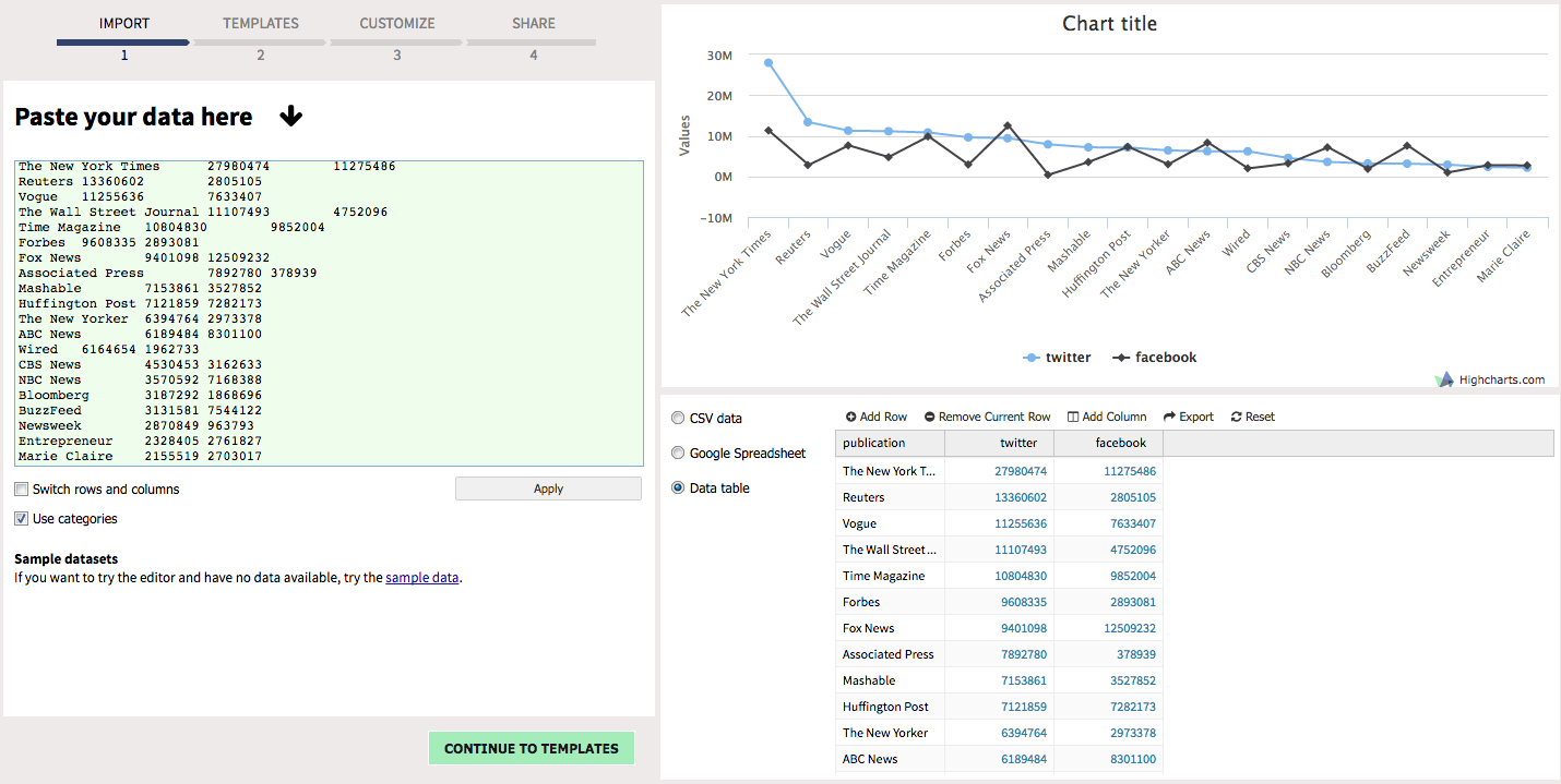
Before we proceed, make sure to check the “use categories” box bellow the dataset. This will ensure that all the data, from all the newsrooms listed, will be used in the chart. It may happen that the chart already plotted all the data, but it is worth checking the box nevertheless.
Choosing the best chart
We are trying to compare the social media following of 20 of the biggest newsrooms in NYC. Proceed to the next step by clicking the green button “Continue to Templates”.
Here is where we will chose the most adequate chart type to render all that data.
As you will see, Highcharts will give you a list of chart types and subtypes to choose from. Feel free to browse around and see how your data look like in different types of graphics.
Right away, we can discard using the line and the area charts, as they are good for time series. In this case, since we are only using one dimension (number of followers) and two categories (Twitter and Facebook), we can also discard the scatter and bubble charts - which can be used when you have more data to display in the same category to show.
Pie charts are used to proportion of a whole. Since it is not our intention to sum up every publication’s social media following and then see how big of a piece each newsroom has, we can leave the pie chart behind. For its turn, polar charts are interesting, but with this kind of data it can be confusing.
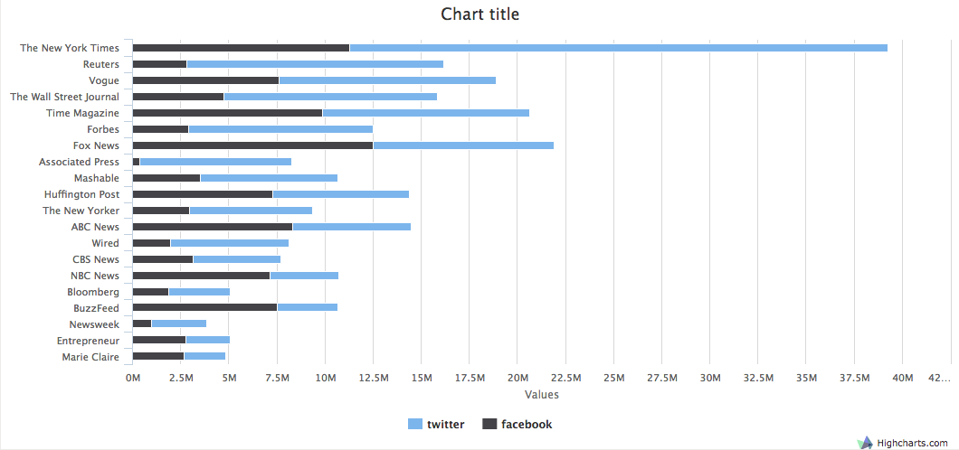
This mostly leaves us with bar/column charts. Lets use the horizontal type, as it will give us a good idea of how to compare the sizes of the bars. Lets also select the stacked subtype, as it will render one bar showing two categories and we can compare both by publication clearly.
You chart will look like this, before customization:
Customizing your chart
After this step, click on the button “continue to customize”. In here, we will make your chart look better.
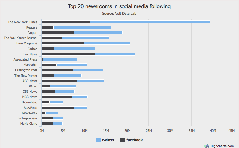
First, lets give it a title (suggestion: “Top 20 newsrooms in social media following”) and a subtitle (suggestion: Source: Volt Data Lab). You can erase the “values” label, as our data already is market with the M, from million, sign.
In the “general” tab, you can customize width, height and other things. We won’t do anything here, no need for that now, there will be an option to do that later when we export it.
Lets change the basic “appearance”. Assing whatever font you want. We will leave it at 18px and will change the font type to Tahoma.
This example will also assign a light grey (hex color #ededed) to the background of the map.
Handling the axes
The axes are one of the most important components of any chart. In here, we will make sure they best represent our data.
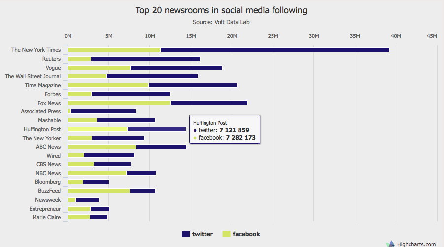
Highcharts allows us to use linear (arithmetic progression) and logarithmic scales (geometric progression). This last one is useful when you data is way too far apart from each point.
For instance, if your data shows 20 million followers in the upper point and mere 500 followers in the lower, you won’t be able to see the smallest bar. It will be there, but will be so small that you can’t see it. The logarithmic scale adjust the scale so you can see all the bars.
In the “axes” tab, try applying the logarithmic scale to the horizontal axis (nothing will happen in the vertical axis because you are using string in that one). The path will be Axes -> Horizontal Axis -> Type -> Logarithmic. You might notice the bottom values have bigger bars now.
Linear Scale:
Log Scale:
That all being said, we won’t apply the log scale in our example, as we don’t need it: all the values are in million and give a good general look about how dominant a few companies are on social media against others.
One last thing here. It will look better for us to put the X axis in the top, so we can see more clearly. Follow this path Axes -> Horizontal Axis -> Opposite side of chart -> Check the box.
Colors and adjustments
Proceed to the data series tab to customize the colors you want to use.
To make sure the colors are very different so we can distinguish them immediately, lets apply the a dark blue (hex color #1c126c) for Twitter and a light yellow for Facebook (hex color #d3e466).
For the tooltip suffix box, lets put the work “ followers” (don’t forget the space tab before), so every time you hover a bar, this suffix appears after the number.
In the vale labels tab, you can choose to plot in the graphic the numbers of followers in each bar. I don’t recommend, as you graphic will look confusing, full of numbers. Also, as it is interactive, you can hover the bars too see the same number.
Our last adjustment before publishing the chart is to assign the shared tooltip between the two categories, so when you hover the bars you will get both Facebook and Twitter numbers at the same time.
Go to Tooltip -> General -> Shared between series.
You graphic, finally, will look like this:
Exporting
Now, finally, go on to the last step for publishing your chart, the “continue to share” button, and save your graphic. There are several options here:
- Share the link to the Highcharts page of your graphic
- Embed the iframe in your webpage
- Download as image or svg
- Take a screenshot
Be a pro
Come back to editing your graphic and explore other options we did not use in this tutorial, as changing label formats, the legends, font-sizes, borders, adding a prefix to the tooltip, change the order of the categories and more.
You may even also change the chart type and choose one that you think will be better.
If you want to use other data to explore this tool, Gapminder has some cool ready-to-use datasets.