How to make a map in Carto without geolocation data
June 5, 2016 Courses Tutorials
Maps are a good way to visualize data about places, geographic patterns, show change over time and obviosuly when a story is completely based on geography.
You can use Maps to show comparisons, proportions, relationships, hierarchy, parts to a whole, distribution of elements, patterns and more. Always beware, as Matthew Ericson writes in “When Maps Shouldn’t be Maps”: just because something can be mapped, it does not mean it should be mapped. Avoid creating maps “when the interesting patterns aren’t geographic patterns” and “when the geographic data is more effective for analysis”. And always distrust your data (specially when it has IP addresses in it.
With that said, in this short tutorial, we will create a Map with data from a .CSV file with Carto.
Carto (kwon before July 2016 as CartoDB) is one of the best tools out there to create web maps. You can make interactive maps, download static image files and customize colors and points. And it is free if you are OK with using the basic features plan (which includes enough resources by most standards).
However, there are a few tricks in both better representing your data and making your map look good.
This brief tutorial will teach how to use the most basic Carto tools to create a map that tells one simple clear story, with few data points.
You will need:
- This example .csv dataset
- An account in Carto
- Bookmark the Carto Editor documentation. It includes every detail about working with the Carto maps editor.
Using the dataset
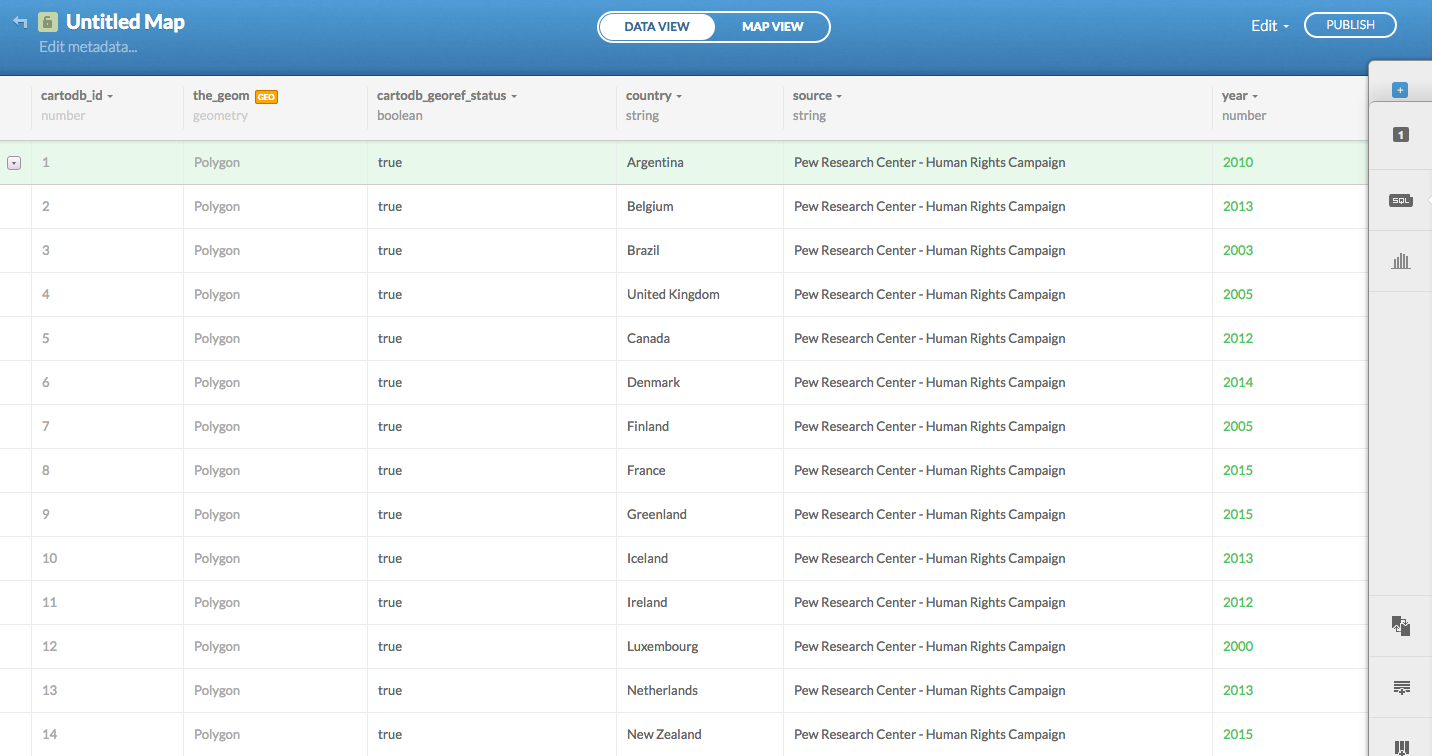
The example dataset bears no mystery at all. It shows countries where same-sex marriage is legally allowed, and holds only three columns of information: country, year and source. The data is from the Pew Research Center.
With only two of those columns it is possible to have a good, descriptive graphic representation about same sex-marriage in the world. Lets load the data.
If you already have an account in Carto, login and right away click on the green button New Map.
This will take you to a screen so you can Add a Dataset.
There are dozens of ways you can upload your data into the Carto server. One of it’s great features is that it accepts several kinds of data formats (like CSV, XLS, ZIP, KML, GPX), and you can use their data library, connect your data from Dropbox, Twitter, Google Drive or upload a data file that you have in your computer.
In our case, we will use a .csv file from a URL. This is the dataset you will use for this tutorial.
Copy the URL of the dataset, then click on the Data File tab and paste the URL, above in the white input field, then click Submit and then in the green button on the bottom Connect Dataset.

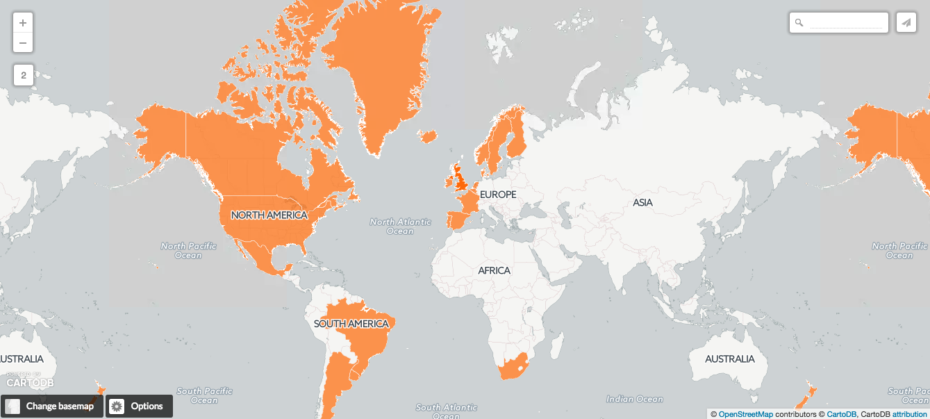
This will lead you to a map canvas with some orange polygons in it. Polygons are the shapes and color fill of all geographic borders of countries (or regions, cities, neighborhoods, etc.). Great, you basically have a map now.
Carto has powerful geocoding features and it will understand things like country names (instead of lat/long, for example) and geocode them from your column containing country names.
WARNING: if you have repeated or misspelled country names, or somehow does not comply with the standards adopted by Carto, it may not work. Be sure to always check how your data is formatted.
You could just put a title like “Countries in the World Where Same-sex Marriage is Allowed” and publish it, but you can make it even better. Lets see how to do that.
In the Data View tab, you can see how the data was automatically parsed by CartoDB when you uploaded from the URL.
Customizing your map
Now that you have successfully uploaded your data, lets add a title and some metadata, in the upper left corner of your screen, by clicking in Edit Metadata. This is not necessary, but it is a good practice.
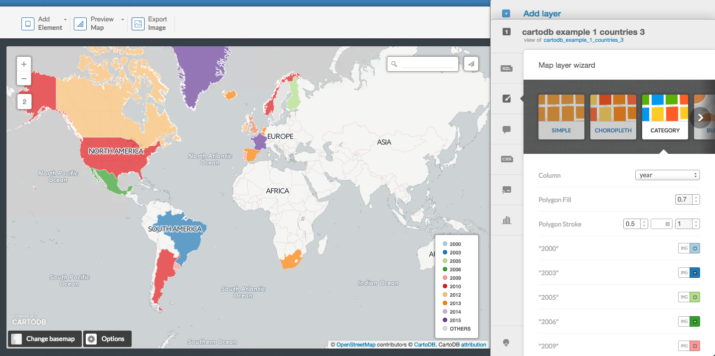
Now, lets adjust the look of the map. In the right side of your screen, there will be a tab with several options - Sql, Wizards, Infowindow, Cartocss, Legends and Filters. For this tutorial, we will only focus in the Wizards.
Click on the Wizards tab. You will see some options that you can configure on your map.
- Simple - plain color fill of a polygon or point
- Choropleth - used to describe intensity of the data in certain areas
- Category - color the polygons according to an assigned category
- Bubble - shows the size of the data in certain areas
We are already by default using the simple type and, as the Category and the Bubble are meant to show sizes, intensity and dimensions of certain values (which we don’t have in this dataset), we will choose the Category type - just so you know how it looks like. It may want to proceed with the simple or the category option.
Remember: this example dataset only contains country name, year and source, not other data points.
You map should look like this:
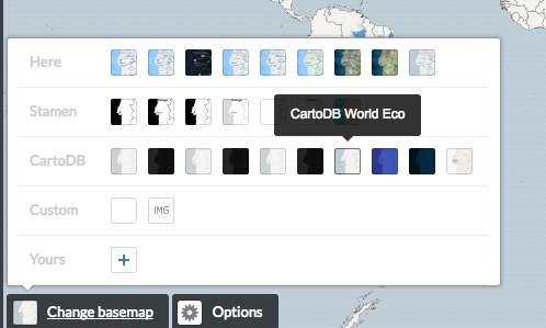
Change the map background
Carto offers a series of basemaps, or the background maps you will use. This option is in the lower left corner of the screen under Change basemap.
Click there and choose a basemap. Let’s pick CartoDB World Eco (you may choose another one if you want).
Now we have a category-colored, background-customized map with year labels in it. We are just missing a proper title and the source.
On the upper left corner, go to Add element -> Add title item and put the title you think it is best. If you don’t know where to put the title box, you can go to Options -> Fixed-title and it will automatically add an upper bar with the title you gave your map earlier, in the metadata section. That is what we will do for this tutorial.
To add a source or annotation items, go to Add element -> Add text item. In this case we want to credit Pew Research Center as the source of the data, and then change the text size to 14px.
Now we are settled. Click export image or publish your map!
It should look something like this:
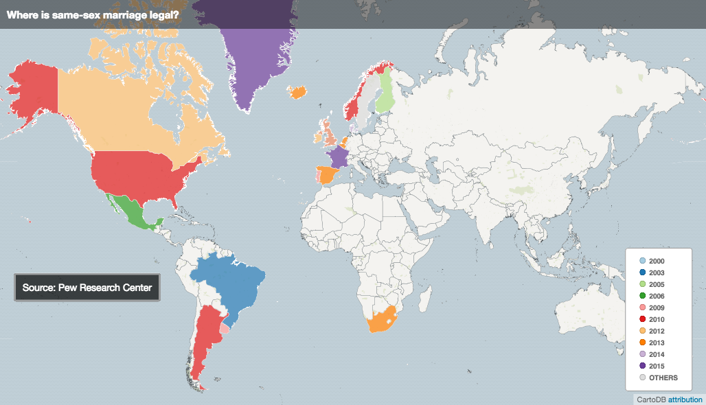
Here is the published map.
Be a pro
Change the custom colors in the CartoCSS editor tab, add interactivity functionalities, publish the map and share the link.