Making a bar chart with ChartJS
May 29, 2016 Courses Tutorials
ChartJS is an easy to use, free javascript library to create interactive line and bar charts with very little code. As most similar tools, it is based in the D3.js library. It was developed by several people.
Like MorrisJS, the advantage of using this library is that you can customize a lot of aspects of your graphic using just one function and a few well-documented configuration options.
It is a little bit more complex than Morris, but it has a few competitive advantages. First, it is built by several people, so it is regularly updated. There are more chart types and is built to be responsive in mobile right from the start. Beyond all that, for the data geeks, it also offers logarithmic or even entirely custom scales with ease. Not being enough, ChartJS is very lightweight (~31kB).
One disadvantage is that the json data must have some specific properties that it understands, like labels and data, so you have to adapt all your dataset. Because of this, however, the tool allows advanced users to perform more customizations.
In this tutorial, you will need to access:
- The example json data
- The ChartJS library CDN link - (this will give access to the code)
- The configuration options’ page (where you will chose the specs for the graphic)
- And a code editor - preferably an online one where you will see the results in real time. This example will use JSbin, but you can use Codepen our JSfiddle as alternatives.
Starting point
Open JSbin. Notice that there will be some HTML code there already, saving you the trouble of adding some tags.
Open another tab in your browser and go to the ChartJS CDN page. Copy and paste the one line of code - <script type="text/javascript" src="https://cdnjs.cloudflare.com/ajax/libs/Chart.js/2.1.4/Chart.min.js"></script> - in the <head> of your [document][you can also put it in the <body> tag, but it loads first if it is in the <head>].
Your code will look like this:
	<!DOCTYPE html>
	<html>
	<head>
	  <meta charset="utf-8">
	  <meta name="viewport" content="width=device-width">
	  <title>This is a bar chart with ChartJS</title>

	  <script type="text/javascript" src="https://cdnjs.cloudflare.com/ajax/libs/Chart.js/2.1.4/Chart.min.js"></script>

	</head>
	<body>

	  <canvas id="myChart" width="400" height="300"></canvas>


	</body>
	</html>
Now that we have the main library loaded the <head> of our code (where nothing will be displayed in the screen), we have to proceed to the <body> tag.
Instead of a <div>, ChartJS uses the <canvas> tag.
Add the following code inside the <body> tag:
<canvas id="myChart" width="400" height="400"></canvas>
This will actually call (make appear) the chart once we put the javascript in it. We will modify this tag a little bit later, so don’t worry right now about it. ___
Adding the javascript
Our next step is to add some javascript code so it can retrieve the charting libraries from those tags we included to the <head> earlier.
ChartJS’ way of “calling” the line chart is fairly simple. Just:
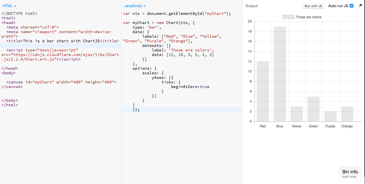
var ctx = document.getElementById("myChart");
Now, we have to add the variable that will bind the data and allow us to customize it. We will use dummy data now. Go ahead and add the following code into the javascript:
	var myChart = new Chart(ctx, {
type: 'bar',
data: {
    labels: ["Red", "Blue", "Yellow", "Green", "Purple", "Orange"],
    datasets: [{
        label: 'Those are colors',
        data: [12, 19, 3, 5, 2, 3]
    }]
},
});
You will now be able to see a small chart some bars.
Adding your own data
In your javascript input, you might have noticed the data line. That is where your chart’s lines are coming from. That field is where you bind the data! ChartJS uses json format, but it has its own specifications as how to structure data, which at first may be not so straightforward, but allows the tool to have more customization[^More advanced users can use JQuery to parse json and .csv files].
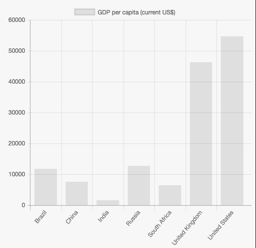
Lets use as example this simple dataset, which show us the 2014 per capita GDP of seven countries.
Copy and past the text after the dataset: in your javascript. It will result in something like this:
	data: {
    labels: ["Brazil", "China", "India", "Russia", "South Africa", "United Kingdom", "United States"],
    datasets: [
					  {
					    label: "GDP per capita",
					    data: [11726.8, 7590.0, 1581.5, 12735.9, 6483.9, 46297.0, 54629.5 ]
					  }
					  ]
					    },
The bar chart will immediately appear in your screen with ChartJS default looks. It is also interactive.
There are some things to understand here so you can work with other data afterwards. In this case:
- The X axis is defined by the
labelsarray; - The Y axis is plotted by the
datafield inside thedatasetarray; - The actual legend/unit is defined by the
labelinside thedatasetarray;
The new plotted chart will look like this:
Customizing your graphic
To add some good-looking visual to your graphic, we will now use some options ChartJS has to offer to change fonts, colors and other specifications. We will also use some CSS to give it a title, a legend, units and a source - all good practices when charting.
Colors
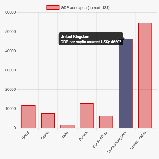
Lets start with by coloring our chart, especially the bars.
This more basic color configuration is applied, generally, within the dataset array. See the code below.
	datasets: [
				  {
	            label: "GDP per capita",
	            backgroundColor: "",
	            borderColor: "",
	            borderWidth: 1,
	            hoverBackgroundColor: "",
	            hoverBorderColor: "",
	            data: [11726.8, 7590.0, 1581.5, 12735.9, 6483.9, 46297.0, 54629.5 ]
	            }
- Lets apply the color red
#c00here, using both the Hex color and Rgba (to get transparency). To convert Hex to Rgba, use this tool. - To have some clear delimitation of the bar area, lets add a solid red
#c00border, of 2px; - For the hover, lets add some nice dark solid blue, to emphasize the bar we are in. Add:
#59597Fto that field, and cut out the hover border color, since we don’t need it;
So far out code looks like this:
	var myChart = new Chart(ctx, {
type: 'bar',
data: {
    labels: ["Brazil", "China", "India", "Russia", "South Africa", "United Kingdom", "United States"],
    datasets: [
	  {
	            label: "GDP per capita",
	    backgroundColor: "rgba(204, 0, 0, .4)",
	            borderColor: "#c00",
	            borderWidth: 2,
	            hoverBackgroundColor: "#59597F",
	            data: [11726.8, 7590.0, 1581.5, 12735.9, 6483.9, 46297.0, 54629.5 ]
	  }
	  ]
	  }
The result for now is this:
Customization
After you input your data and added the basic color visuals, there are plenty of more things you could do. But first, you have to add the options config. You can check all the ChartJS options here.
After the end of your data, when you closed it with a comma, lets add this small line of code options: {}.
You code will look like this:
  var ctx = document.getElementById("myChart").getContext("2d");


	var myChart = new Chart(ctx, {
	    type: 'bar',
	    data: {
	        labels: ["Brazil", "China", "India", "Russia", "South Africa", "United Kingdom", "United States"],
	        datasets: [
					  {
	            label: "GDP per capita",
	    backgroundColor: "rgba(204, 0, 0, .4)",
	            borderColor: "#c00",
	            borderWidth: 2,
	            hoverBackgroundColor: "#59597F",
	            data: [11726.8, 7590.0, 1581.5, 12735.9, 6483.9, 46297.0, 54629.5 ]
					  }
								  ]
				    },
	    options: {
								}
	});
Now, we are ready to add some other customizations here, like fonts, grids and other cool stuff.
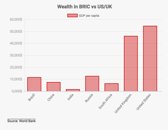
Interlude to get a font
Go to Google Fonts to fetch some nice typography. We will use Roboto - make sure you select the light (400) and bold (700) types of font (for body and header).
If you want Roboto, copy and paste this link into the <head> of your HTML: <link href='https://fonts.googleapis.com/css?family=Roboto:400,700' rel='stylesheet' type='text/css'>
Lets add some smooth animation right out of the box, so your chart get even more atention. Lets add a 3 seconds (or 3,000 milliseconds) animation: animation: {duration: 3000},
Now, lets configure the scale, where the better part of certain charts is. First, the yAxes: [ { } ]. Inside it, simply add one display: true - nothing happens, but you will see later why we did it.
Now, still inside the yAxes, add the ticks: {}, followed by the following configs:
beginAtZero: true,- this will tell your chart to start a zero, which is often the case, unless your baseline is different;fontFamily: 'Roboto',- don’t forget the font’s link in the<head>;fontSize: 14,- in pixels;fontColor: '#ababab',- make it gray;
As you can see, the Y axis numbers are not the best to show the data, without the commas. There are plenty of ways to use javascript to manipulate that number. We will make something easy, almost prosaic - trick the code to show the same number, but differently.
Lets add a javascript function to do that, using the callback option:
callback: function(value) { return value/1000 + ',000' + '$'; },
What we did here was to divide the original format by 1,000 and then add the zeroes again with a comma, plus the dollar sign. This happens because you cannot input comma in a data that is separated by another comma, as the code will read a different number - for instance: 10,000 would read 10 and 000, not 10000. Now it looks better.
Your yAxes code should be the following:
		yAxes: [{
			  display: true,
			  ticks: {
				beginAtZero: true,
				fontFamily: 'Roboto',
				fontSize: 14,
				fontColor: '#ababab',
				callback: function(value) { return value/1000 + ',000' + '$'; },
				},
		    }],
Let’s do basically the same thing with the xAxes, but this time, lets make our chart cleaner. Assign gridLines: {display: false}, to hide the vertical gridlines.
This is the code:
		xAxes: [{
		    gridLines: {
		    display: false
				},
		    ticks: {
		    fontFamily: "Roboto",
		    fontSize: 14,
				},
	      }],
Before we finish, lets make sure our chart is responsive, by adding responsive: true, before closing the options config.
Finally, lets credit the data in the HTML, after the <canvas> tag. Add the source: <h5>Source: World Bank</h5>, as well as some basic CSS, to make it look better.
	body {
	  padding: 0px 20px 10px 30px;
	  font-family: 'Roboto', sans-serif;
	}

	p {
		line-height: 1.4em;
		}

	h5 {
	  border-top: 1px solid #000;
	  display: inline;
	  font-weight: 400;
	}
Result
Your chart will now look like this:
Check out the code
Find the code here, in this JSbin.
Be a pro
If you feel you are ready for more, try “breaking” your chart’s code so it is easier to read and manipulate. This takes more time to learn, but it is sure worth your while in the long run if you want to dig deeper.
The new code is here, in this JSbin.