Making a bar chart with MorrisJS
May 30, 2016 Courses Tutorials
Line chart with Morris.js
Morris.js is an easy to use, free javascript library to create interactive line and bar charts with very little code. As most similar tools, it is based in the D3.js library, with dependencies in Raphael.js and JQuery. It was developed by Olly Smith.
The advantage of using this library is that you can customize a lot of aspects of your graphic using just one function and a few well-documented configuration options. Binding the data is also pretty easy, using the json format.
In this tutorial, you will need to access:
- The example json data
- The Morris.js library CDN link - (this will give access to the code)
- The configuration options’ page (where you will chose the specs for the graphic)
- And a code editor - preferably an online one where you will see the results in real time. This example will use JSbin, but you can use Codepen or JSfiddle as alternatives.
Starting point
Open JSbin. Notice that there will be some HTML code there already, saving you the trouble of adding some tags.
Open another tab in your browser and go to the Morris.js webpage. Scroll down a little bit to the “Getting started” section and copy and paste the four lines of code in the <head> of your HTML. You could also put it in the <body> tag, but it loads first if it is in the <head>.
Your code will look like this:
	<head>
	  <meta charset="utf-8">
	  <meta name="viewport" content="width=device-width">
	  <title>This is a Morris.js chart!</title>
	  <link rel="stylesheet" href="//cdnjs.cloudflare.com/ajax/libs/morris.js/0.5.1/morris.css">
	  <script src="//ajax.googleapis.com/ajax/libs/jquery/1.9.0/jquery.min.js"></script>
	  <script src="//cdnjs.cloudflare.com/ajax/libs/raphael/2.1.0/raphael-min.js"></script>
	  <script src="//cdnjs.cloudflare.com/ajax/libs/morris.js/0.5.1/morris.min.js"></script>
	</head>
Now that we have the libraries loaded the <head> of our code (where nothing will be displayed in the screen), we have to proceed to the <body> tag.
Add the following code inside the <body> tag:
<div id="myfirstchart" style="height: 250px;"></div>
This will be where the chart will render once we put the javascript in it. We will modify this tag a little bit later, so don’t worry right now about it. ___
Adding the javascript
Now the real fun begins.
Our next step is to add some javascript code so it can retrieve the charting libraries from those tags we included to the <head> earlier.
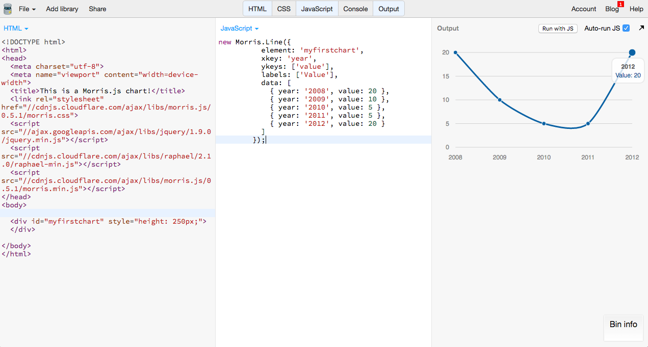
Morris.js way of “calling” the line chart is fairly simple. I will use the basic example given by their website, and we will change it later.
Go ahead and add the following code [^Notice that this tutorial “cleaned” the code provided in the Morris.js website, taking of the comments and putting the data in the end of the code] into the javascript:
	new Morris.Line({
	  element: 'myfirstchart',
	  xkey: 'year',
	  ykeys: ['value'],
	  labels: ['Value'],
	  data: [
	    { year: '2008', value: 20 },
	    { year: '2009', value: 10 },
	    { year: '2010', value: 5 },
	    { year: '2011', value: 5 },
	    { year: '2012', value: 20 }
	  ]
	});
Voilá! You will now be able to see a small chart with a blue line and five points in it.
Adding your own data
In your javascript input, you might have noticed the data line. Well, that is where your chart’s lines are coming from. That field is where you bind the data! The format recognized by Morris is json, which is a way to structure data used by a lot of tools.
NOTE: If you have tabular data from Excel or Google Sheets, you can transform it into json using this awesome online tool CSV 2 Json, from Martin Drapeau.
Lets use as example this simple dataset compiled by this tutorial - in this case US GDP unemployment rate.
Copy and past the json after the data: in your javascript. It will result in something like this:
	data:
		[
  {
    "index": "Unemployment rate",
    "rate": 9,
    "year": 2011,
    "dates": "2011-1"
  },
  {
    "index": "Unemployment rate",
    "rate": 8.2,
    "year": 2012,
    "dates": "2012-1"
  },
  {
    "index": "Unemployment rate",
    "rate": 7.4,
    "year": 2013,
    "dates": "2013-1"
  },
  {
    "index": "Unemployment rate",
    "rate": 6.2,
    "year": 2014,
    "dates": "2014-1"
  }
]
Right after you input the data, nothing will happen just yet, but that is just because the code is not reading your data columns properly, so we will now address that issue.
We will now work with the axis of our chart: the X (horizontal) and the Y (vertical).
In your javascript panel, go to xkey option. This will define which data that will be used to define the X axis of the graphic - in this case, the dates[^We deliberately added the ’s’ after ‘date’ so you know where to look].
Note that the year is here recognized as a number, not a string - so Morris.js would see it as a date with quotation marks, like this ”2012”. Check all the valid date formats for this library here.
We will leave the ykeys with the value field. In the label field you can add anything you want, as long as it is in quotes - this will reflect in the tooltip of your chart - we will add 'Unemployment rate'.
Also add this line: xLabels: ['year'],. This will avoid your chart to read the months when it renders, leaving only the years in the X axis.
So this part of your code will look like this:
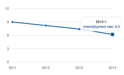
new Morris.Line({
	  element: 'myfirstchart',
	  xkey: 'dates',
	  ykeys: ['rate'],
	  labels: ['Unemployment rate'],
	  xLabels: ['year'],
Which will render this:
Customizing your graphic
To add some good-looking visual to your graphic, we will now use some options Morris has to offer to change fonts and colors. We will also use some CSS to give it a title, a legend, units and a source - all good practices when charting.
Text-size, colors and goals
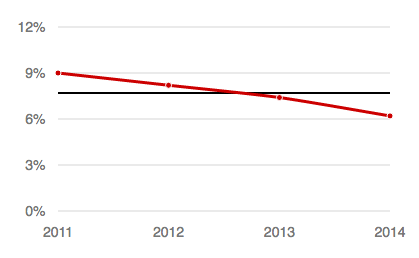
Lets start with the text-size, the colors and some goals (references in the chart). After the code mentioned above, and before the data, lets add the following lines:
	lineColors: [''],
  postUnits: [''],
  goals: [''],
  goalStrokeWidth: [''],
  goalLineColors: [''],
  pointSize: [''],
  gridTextSize: [''],
  gridTextColor: [''],
- First, the colors of the lines. Lets give it a red look, so inside the brackets add
#C00; - Second, the post units. Since we are talking about unemployment rate, it is a percentage, so add
%inside the brackets and it will add the sign to the Y axis; - Then, its time for the goals, which are nothing more than the main marks you want to add to your chart. It can be the average, the median, the regression line - it can be any number. I will make it the average of all the values we inputed, or 7.7. This is cool to serve as reference, and you can add several, separate by commas, like this
[‘GOAL 1’, ‘GOAL 2’, ‘GOAL 3’]; - The goal stroke width is noting more than how thick it is. I will set to 2px (default is 1px), and make it black
#000; - Point size is how big are the data points. If you want no points, use it 0. I will use 3px;
- The grid text size will define, well, the size of your text - I will use a 14px font. The text color define, well, the color - I will use some medium gray
#777;
In case you have noticed, Morris make it default to show the tooltip all the time, even if you don’t want. It is kind of annoying, so we will set for the tooltip to appear only when you hover.
Add the following line: hideHover: ['auto’],. This will do the trick.
So far out code looks like this (I am not adding the data for size limits):
	new Morris.Line({
					  element: 'myfirstchart',
					  xkey: 'dates',
					  ykeys: ['rate'],
					  labels: ['Unemployment rate'],
	          xLabels: ['year'],
	          lineColors: ['#C00'],
				    postUnits: ['%'],
			      goals: ['7.7'],
			      goalStrokeWidth: ['2px'],
	          goalLineColors: ['#000'],
			      pointSize: ['3px'],
			      gridTextSize: ['14px'],
			      gridTextColor: ['#777'],
	          hideHover: ['auto'],
The result for now is this:
Custom fonts
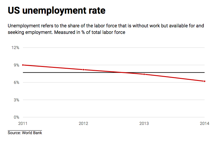
Now, we are ready to add some good looking fonts here. In this example we will use Roboto, but you might as well use any Google Fonts option.
In the Roboto page, make sure you select the light (400) and bold (700) types of font (for body and header).
Copy and paste this link into the <head> of your HTML: <link href='https://fonts.googleapis.com/css?family=Roboto:400,700' rel='stylesheet' type='text/css'>
Then, back to your javascript panel, proceed to add the option to enable it into the chart: gridTextFamily: ['Roboto'],
Very nice. We are now almost done, lets just add some title, legend and source back in the HTML panel.
Above the <div> tag, add <h1> (title) and <p> (legend), as well as some <h5> (source) below the chart. Like this:
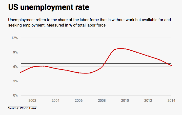
	<body>
	  <h1>US unemployment rate</h1>
	  <p>Unemployment refers to the share of the labor force that is without work but available for and seeking employment. Measured in % of total labor force</p>
	  <div id="myfirstchart" style="height: 250px;">
	  </div>
	  <h5>Source: World Bank </h5>

	</body>
To apply the font - and some other styles (like margin or padding) that you want - go to the CSS panel and add your styles. We will only add a few things:
	body {
	  padding: 0px 20px 10px 30px;
	  font-family: 'Roboto', sans-serif;
	}

	p {
		line-height: 1.4em;
		}

	h5 {
	  border-top: 1px solid #000;
	  display: inline;
	  font-weight: 400;
	}
Make it responsive
Finally, we have to make our chart responsive, so it fits several kinds of screens.
Fortunately, Morris allows us to do it rather easily. Just add the following line to the code: resize: ['true'],
This will apply the 100% width to fit the screen. Let’s make it a little bit higher too: in the HTML, apply the height to 350px, like this: ` <div id="myfirstchart" style="height: 350px;">`
Your chart will now look like this:
Try adding more data to see how it looks
We prepared some more data to you, so you know how it looks when you add more stuff to it.
It is still the same data - US unemployment rate - but this time since 2001. You can find it here.
Just don’t forget to recalculate the average for your goal as you have more data now.
Check out the code
Find the code here, in this JSbin.
Bonus
If you feel you are ready for more, try this code with a function from JQuery to retrieve the data directly from a URL, instead of adding the JSON directly into the file:
The new code is here, in this JSbin.